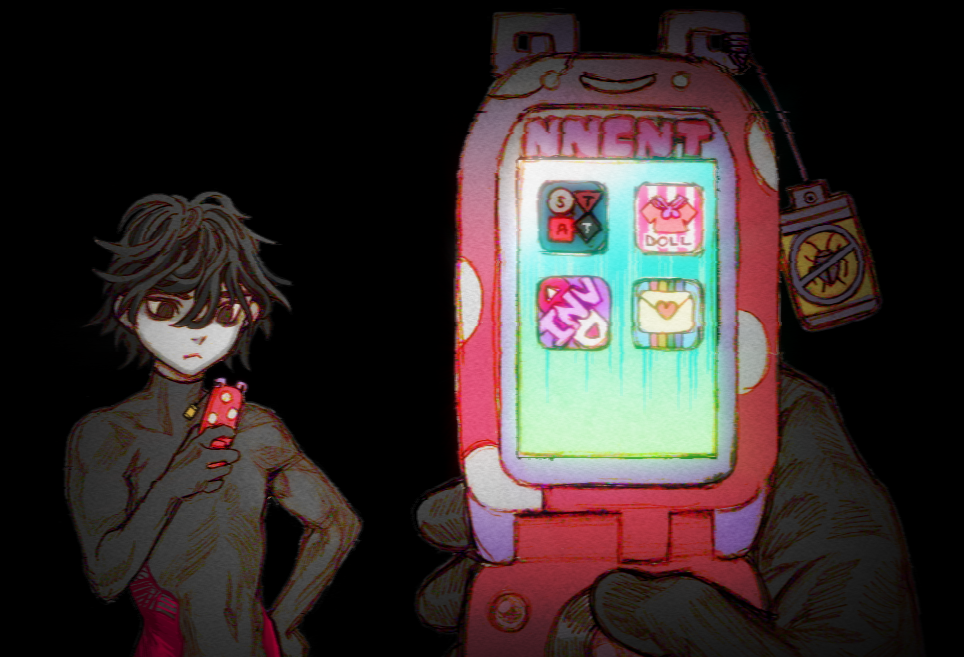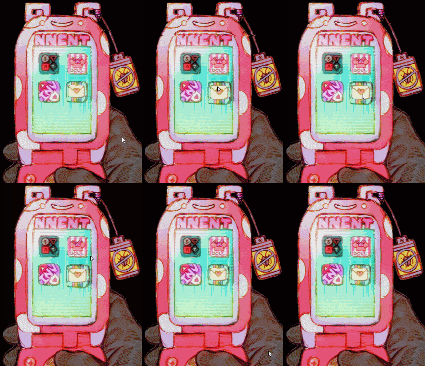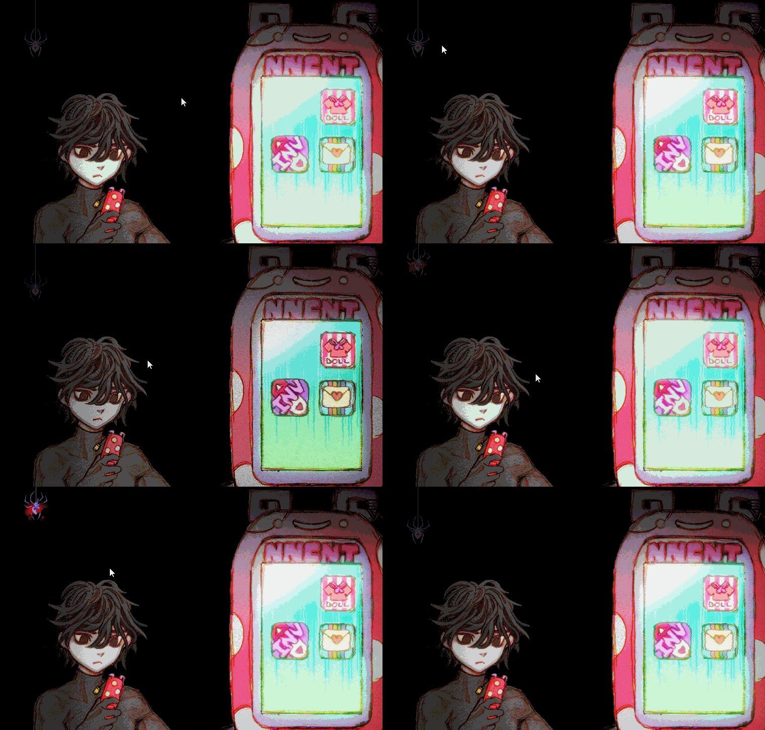
greenie made a beautiful UI for the game: Perfect’s INNOCENT-issue flip phone. the last time phones were MANLY.

check your stats, fashion, inventory, messages; each menu is a program in your phone, and you can unlock more (i like the idea of porn, malware, “lil pal” progs, etc…)

“back button”? ok homo. how about you kill something if you want to go back that bad?
when it comes to UI, style is INFINITELY more important than substance. we do not “User Interface” we “Loser Interface”. from the moment your player clicks the mouse they have lost. they are undoubtedly a slimy failure and cannot be reasoned with. it is beyond fact that “gamers” are the ruined fuckholes of the consumer world.
“good UI”? “minimal”? “clarity”? “accessibility features”?
get the fuck out of here…
the gamer is an animal who will click through ten menus in their favorite jrpg just to pick up a rock or some shit. gaming is an expression of their innate desire to submit. “SUBmenus”? hello???
UI is also an expression of the player’s stats. the higher a stat, the more it inflicts its way of organizing information on you…but that’s a story for another day!!
